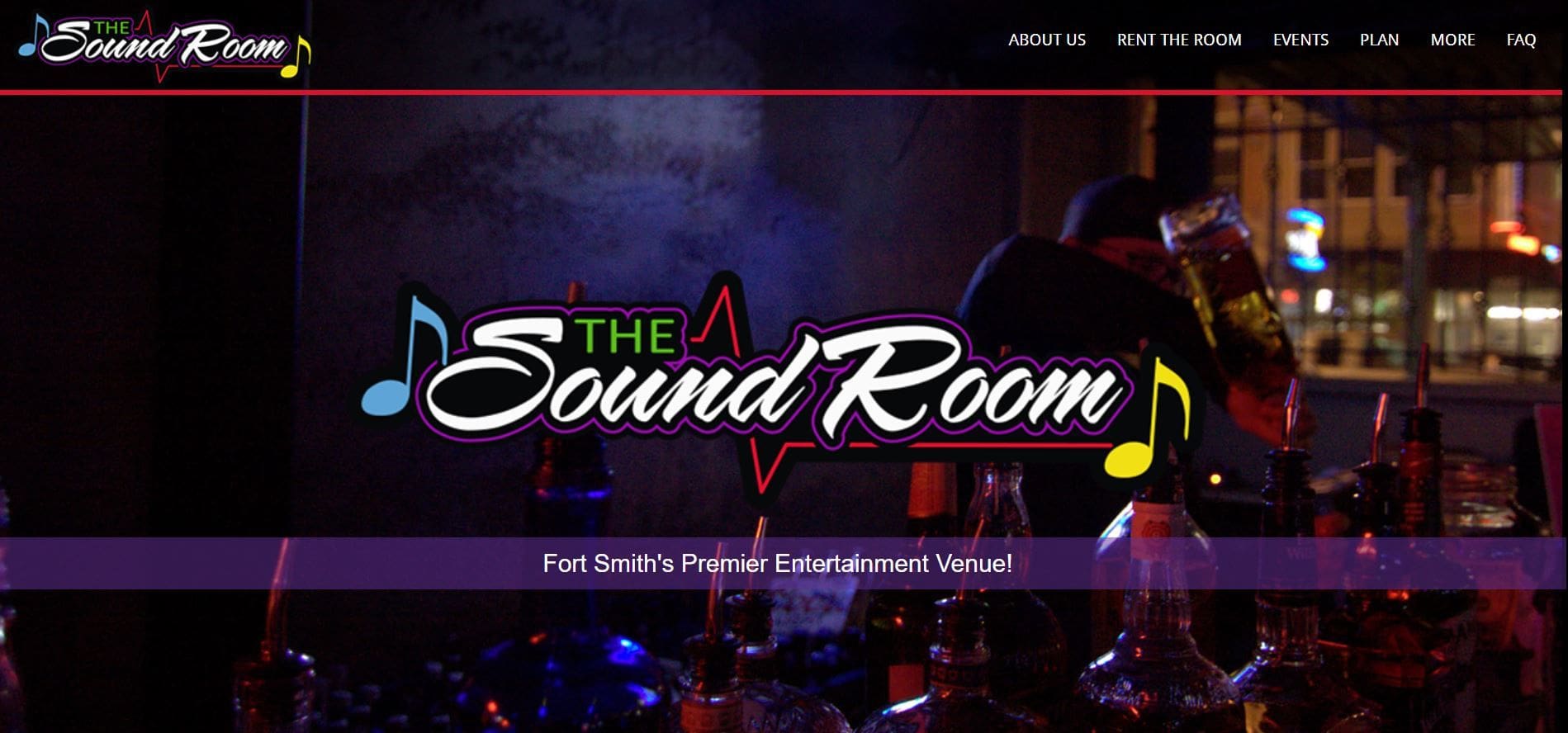
You may be focused on the content of your website and rightfully so, but your background is a core feature that determines how visually interesting your website is. A good video background creates a vibe, sets the tone and/or induces an emotional reaction. A background also holds the theme of a website.
{loadposition JRTVideo}
Video backgrounds help you sell your product. Use the video to show people using your product, so they can visually experience the act of using it. This is where you inspire the type of life your customers could have if only they had your product. The video gives readers a chance to know about your product without ever reading one word on your site. If your product or service is complex that needs a detailed explanation, video background might not be a good idea.
Use background videos give your viewers a sense of excitement or vibe. Think about a cruise company. Logging onto their website and seeing a beautiful, big ship sailing in the open waters of the Caribbean is enough to at least pique your interest and possibly set up an account; therefore, resulting in you gaining a customer’s email address. Check out the background photo for the Sound Room. It creates a cool vibe that makes you want to go see what the place is all about.

There are two types of backgrounds: body and content.

The
body background is in the distance. This is where you will place a static image, illustration, pattern or video.
The
content background is just what the title suggests. It is the background for the text, images, and other base data or information. The content background should be static to avoid distracting your viewer from the content.
Layering the two types of backgrounds gives your site depth and interest. Separate the content background to add more interest and ease of reading. Overlaying your video background with color creates a uniform look especially when you incorporate your brand colors. Your web designer can help you decide the best choice for your business. Allowing some graphic to bleed into the content area creates a smooth layout and added depth by creating a unified and modern look.
A blog posted on
www.usabilla.com, states, “An important point to consider is the contrast between background and text.” They go on to say that the better the contrast, the readability. The color of your content (such as text, button) must contract against your video or static background. Too many colors create noise and distract the reader.

A few guidelines for using graphics are:
- Graphics should enhance the design, structure, and content without distracting.
- Avoid graphics with large file sizes that add to the load time of the page.
- Use the graphics to help guide the viewer’s focus to the important content on the page.

- The graphics should complement what your homepage is trying to achieve.
- Limit the video to 5-10 seconds long. Looping your video continuously gives the impression that the video is longer than it really is.
- Audio in background video has been ranked as one of the most annoying things to viewers, so just don’t do it.
Use a video background to show viewers what you are all about. This is your chance to set yourself apart from your competition. Entice your customers to come on in and experience your business. Cyberspyder can help you develop that standout video for your business. Contact today!


