Is Your Website Design Broken?
November 3, 2015

What does your website design say about you?
Quick! Open a new tab and click over to your homepage or blog right now.
Now squint and start assessing the design. Don’t worry about the content, just the layout. Now, ask yourself:- Does it look like a professional design? Or like an amateur cranked it out overnight on one of those “free” website creators?
- Is the content divided into small, easily digestible nuggets?
- Here’s the tough one. Imagine that you’re a stranger. Would you trust this website with your business?
1. Do you really expect me to read all of this?
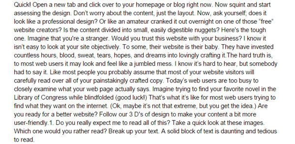
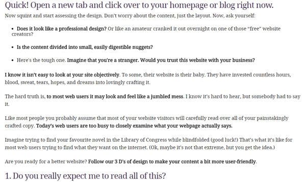
Break up your text. A solid block of text is daunting and tedious to read. Presenting the information in smaller bite-sized nuggets makes it easier to absorb, and more importantly, scannable. Take a quick look at these images. Which one would you rather read?Example A

Or…
Example B

 Web users will spend roughly 3-5 seconds scanning your page before moving on to the next one.
2. Don’t make me think.
Web users already have plenty on their mind. “Did I load the dishwasher? I hope to get this project wrapped up before the deadline. Oh look a new notification subject: ‘5 foods you should never eat!’ I guess I could spare 5 minutes to check this out. Now, what was I looking for again?” As you can see, it doesn’t take much to derail that train of thought. Web users are distracted. Don’t make it hard for them to find what they are looking for.
 Make all of your content mobile friendly!
3. Don’t assume anything.
It may be nearing the end of 2015 and practically everyone has a smartphone in their pocket, but it doesn’t mean you should assume all web users can actually use the web. The visual nature of the internet puts visually impaired users at a huge disadvantage. These users aren’t going to let a little thing like visual impairment keep them from enjoying the web. With the help of special accessibility apps known as screen readers, they can enjoy the internet. Does your website support a screen reader? (I wasn’t joking about making your content so easy find that you should be able to find it blindfolded.) Don’t assume anything. Many of today’s web users are visually impaired and reading a screen is not as easy as reading braille.
When was the last time you updated your website?
Need help giving your website a much needed facelift? The web design team at CyberSpyder Web Services has over 15 years of experience. We are eager to help you overcome your challenges and meet your business goals.Invest in a website that works for you, not against you.
Call 479-782-0005 or shoot us an email to get the conversation started!
©2000 - 2025 CyberSpyder Marketing Services

